In today’s digital age, mobile devices account for a substantial portion of web traffic. To ensure a seamless user experience and maintain a competitive edge, having a mobile-friendly website is no longer an option—it’s a necessity. Responsive web design in WordPress offers a solution to cater to the diverse screen sizes and devices used by your audience. In this article, we’ll explore tips and strategies to create mobile-friendly WordPress websites that adapt gracefully to various screens.
1. Choose a Mobile-Responsive Theme:
Start by selecting a WordPress theme that is designed to be mobile-responsive. This ensures that your website will adapt to different screen sizes without requiring extensive customization.
2. Prioritize Content Hierarchy:
Consider the hierarchy of your content. On mobile devices, space is limited, so prioritize the most essential content and elements. Use headings and subheadings to structure your content effectively.
3. Optimize Images:
Images are essential for engaging content, but they can slow down your website on mobile devices. Compress and optimize images for the web, and use responsive image techniques to serve appropriately sized images based on the user’s device.
4. Use Mobile-Friendly Fonts:
Choose legible fonts that are easy to read on smaller screens. Avoid using tiny fonts or fonts that are too fancy, as they can lead to a poor user experience.
5. Implement Responsive Navigation:
Navigation menus can be tricky on mobile devices. Consider using a responsive navigation menu, such as a hamburger menu, that is easy to access and use on smaller screens.
6. Test Cross-Browser Compatibility:
Your website should work well on various mobile browsers, including Chrome, Safari, Firefox, and Edge. Test your website’s compatibility and functionality across these browsers to ensure a consistent user experience.
7. Mobile-Friendly Forms:
If your website includes forms, optimize them for mobile users. Use clear labels, larger input fields, and touch-friendly buttons to make form submission easy on mobile devices.
8. Opt for Touch-Friendly Elements:
Buttons, links, and interactive elements should be large enough to tap with a finger. Avoid placing these elements too close together to prevent accidental clicks.
9. Use Media Queries:
Media queries are CSS techniques that allow you to apply different styles based on the screen size or device. Use media queries to make your website’s design responsive and adapt to various screens.
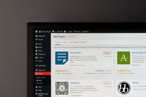
10. Leverage a Mobile-Friendly Plugin:
Consider using mobile optimization plugins like WP Touch or WP Mobile Menu to enhance the mobile experience of your WordPress website.
11. Prioritize Page Speed:
Mobile users are often on slower connections. Optimize your website’s performance by minimizing HTTP requests, leveraging browser caching, and using Content Delivery Networks (CDNs).
12. Test on Real Devices:
While testing on simulators and emulators is helpful, testing on real devices is essential. Borrow or invest in various mobile devices to check your website’s functionality across different platforms.
13. Enable Accelerated Mobile Pages (AMP):
AMP is a Google-backed project that accelerates the loading of web pages on mobile devices. Implementing AMP can lead to improved search engine rankings and faster mobile page loading times.
14. Monitor Mobile Usability:
Use Google Search Console to monitor mobile usability issues on your website. It provides insights into mobile-specific problems and suggestions for improvements.
15. Create a Mobile-First Strategy:
Consider adopting a mobile-first design and development strategy. Start by designing for mobile devices and then progressively enhance the experience for larger screens.
16. Avoid Pop-ups and Intrusive Ads:
Intrusive pop-ups and ads can be frustrating on mobile devices. Use them sparingly and ensure they are easy to close.
17. Optimize for Local Search:
If your business has a physical location, optimize for local search. Use structured data and local SEO techniques to improve your mobile visibility in local search results.
18. Regularly Test and Update:
The landscape of mobile devices and browsers is constantly evolving. Regularly test your website on new devices and update your design and functionality accordingly.
19. Ensure Consistency:
Maintain a consistent brand and user experience across all devices. Users should recognize your website whether they visit it on a desktop or mobile device.
20. Provide a Mobile-App Alternative:
If your website offers unique features or content, consider developing a mobile app as an alternative for users who prefer app experiences over mobile websites.
Conclusion
Responsive web design in WordPress is essential for creating mobile-friendly websites that cater to the needs of your diverse audience. By following these tips and strategies, you can ensure that your website adapts gracefully to various screen sizes and devices, providing an excellent user experience across the board. Mobile-friendliness not only improves user satisfaction but can also positively impact your search engine rankings, making it a critical aspect of modern web development. Stay committed to providing a seamless mobile experience, and your WordPress website will thrive in the mobile-first digital landscape.


